Typography
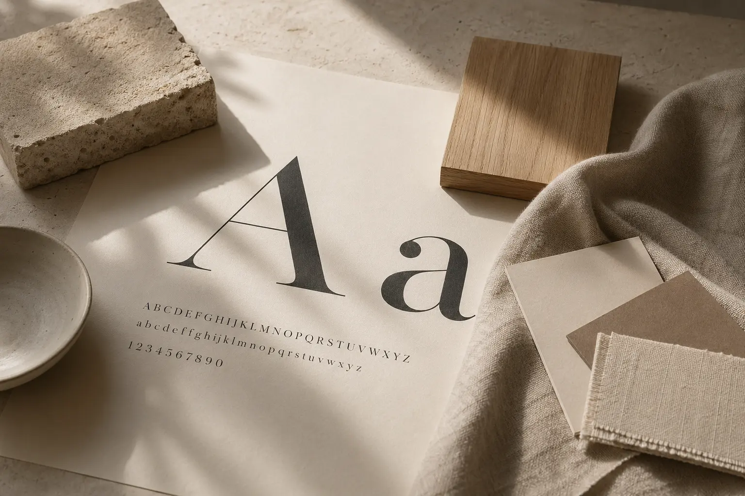
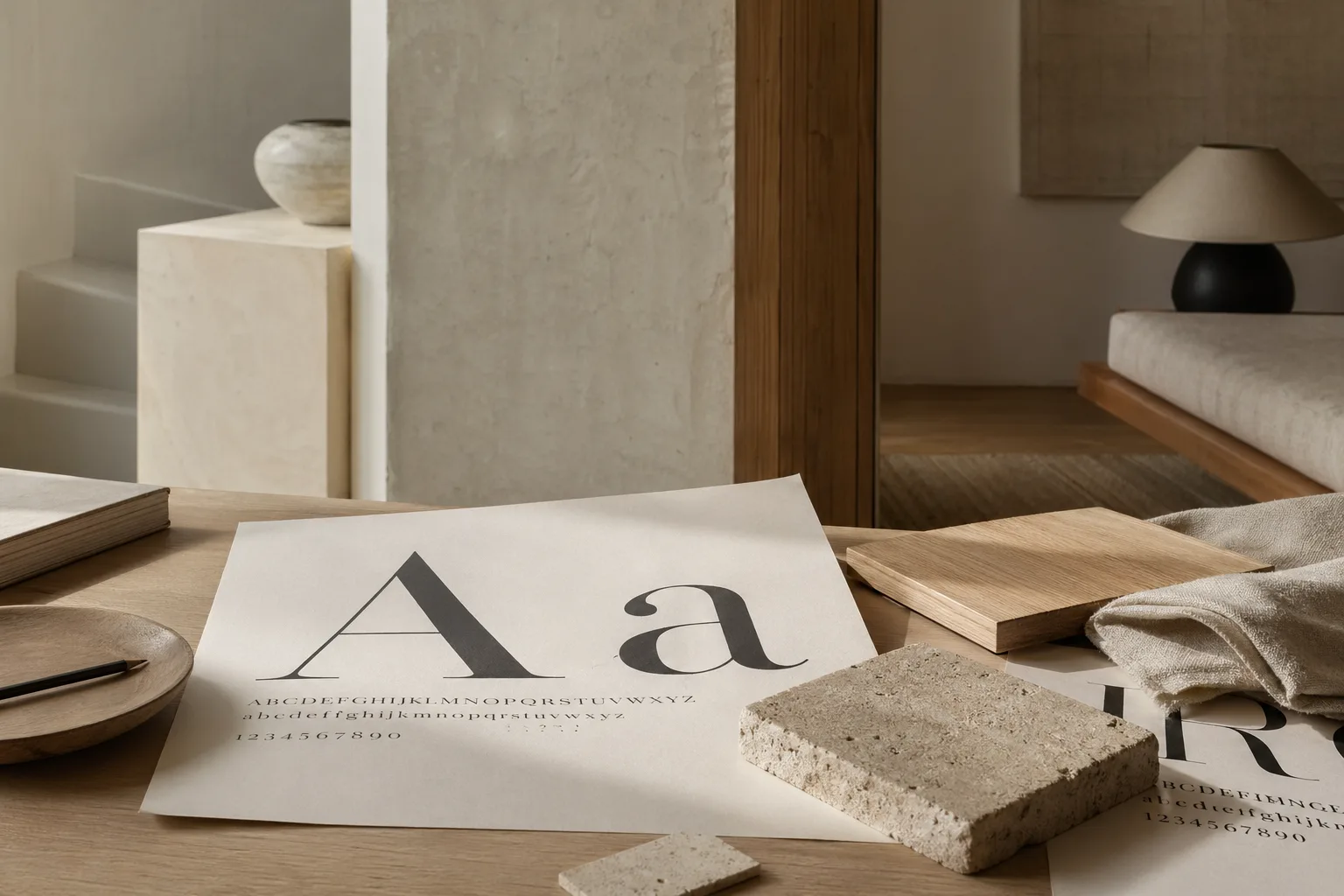
Typography and Emotion
Explore how typographic rhythm, contrast, and scale shape emotion across editorial design, interiors, and visual perception.
Independent Design Journal
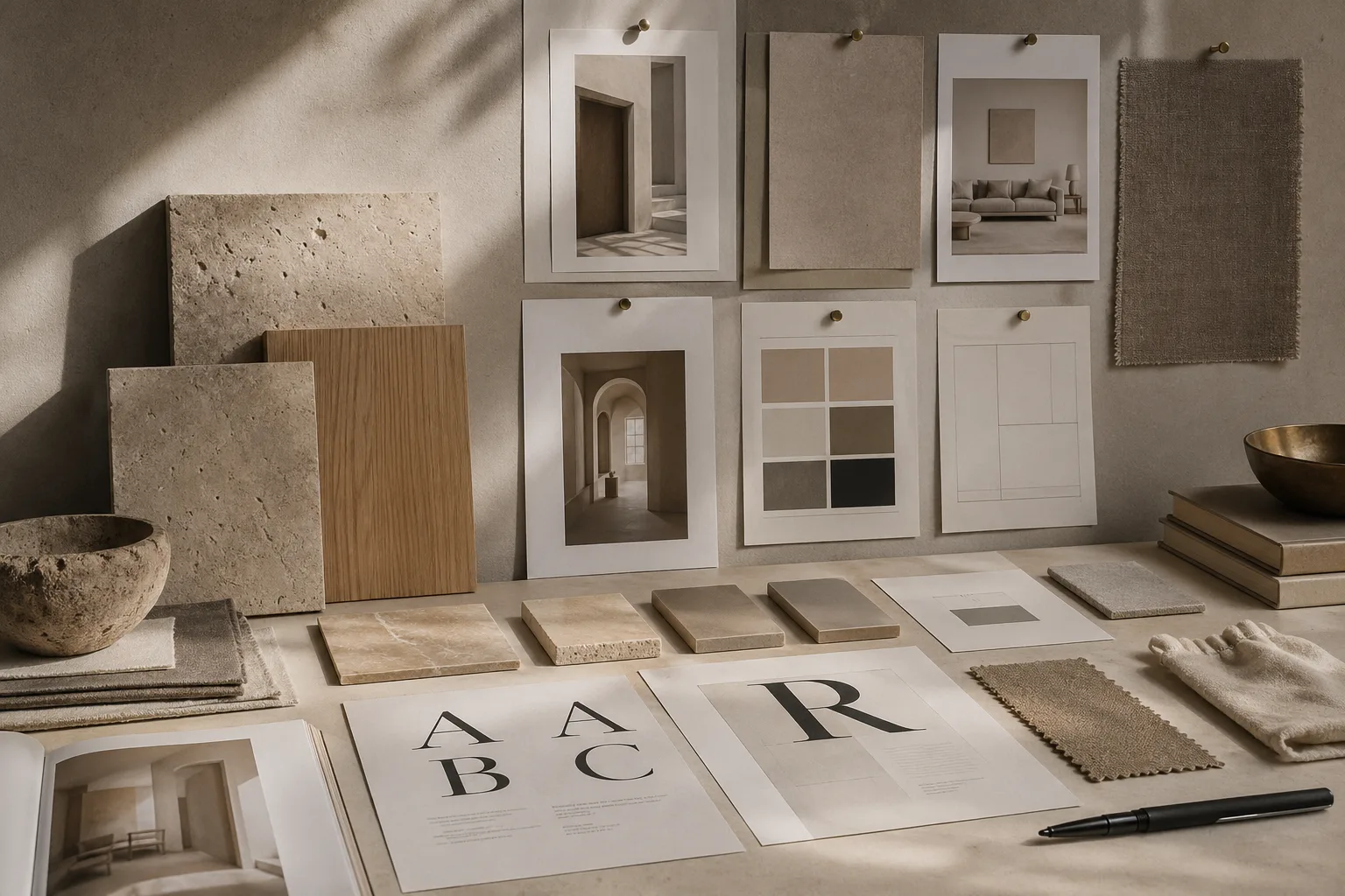
Compulsive Bodoni follows the line between printed form and lived space: editorial type, wall finishes, light, texture, color psychology, and the visual systems that shape how rooms are felt.
Featured Article
Explore how typographic rhythm, contrast, and scale shape emotion across editorial design, interiors, and visual perception.
The opening essay considers why letterforms still shape feeling, and how editorial pace naturally extends into interiors, materials, and spatial mood.
Read “Typography and Emotion”Latest Articles
Typography
Explore how typographic rhythm, contrast, and scale shape emotion across editorial design, interiors, and visual perception.
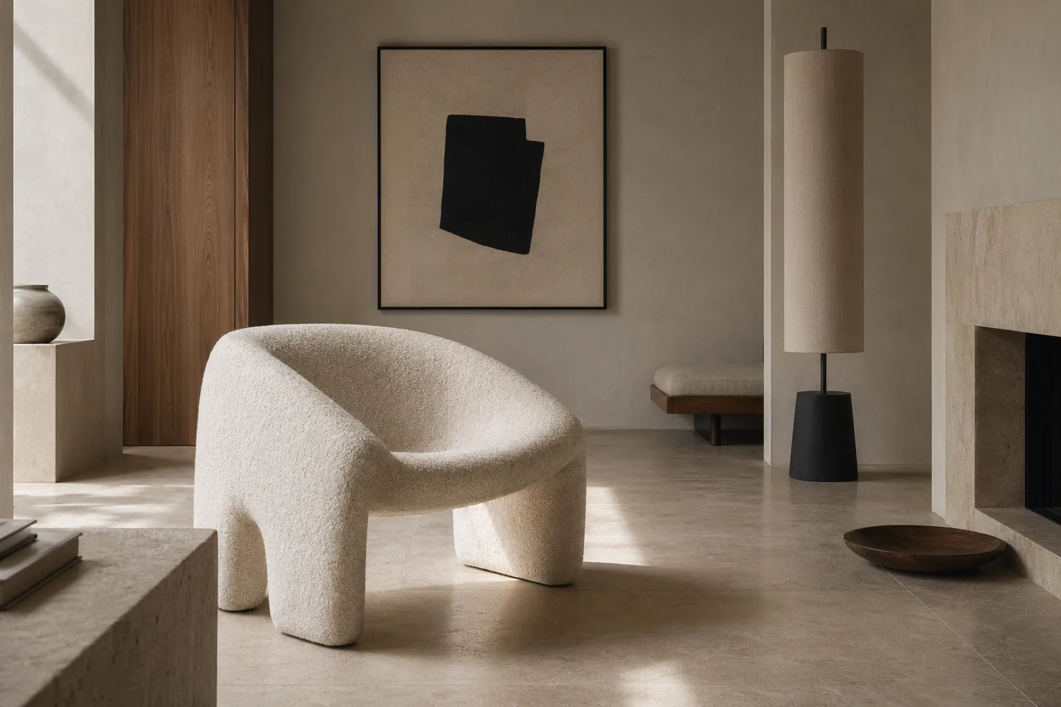
Spatial Design
A design-led look at how proportion, contrast, and sequencing create visual hierarchy inside rooms and interior compositions.
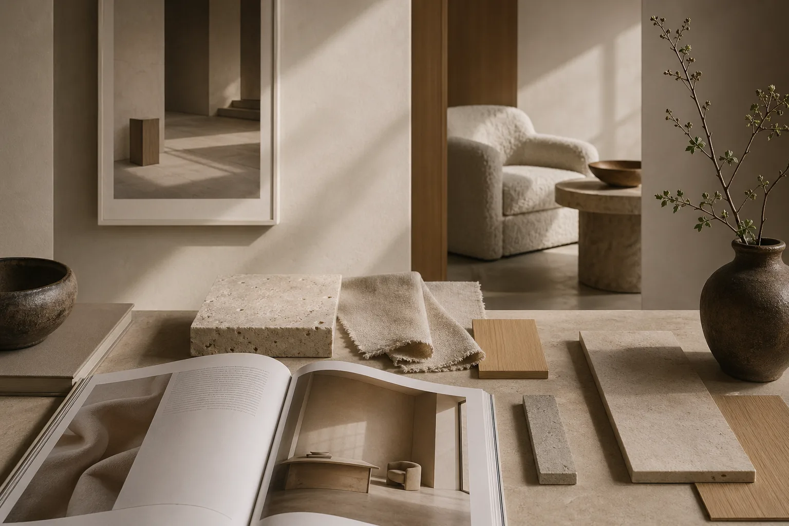
Surfaces
See how plaster, paint sheen, and texture shift depth, warmth, and visual calm in contemporary interior design.
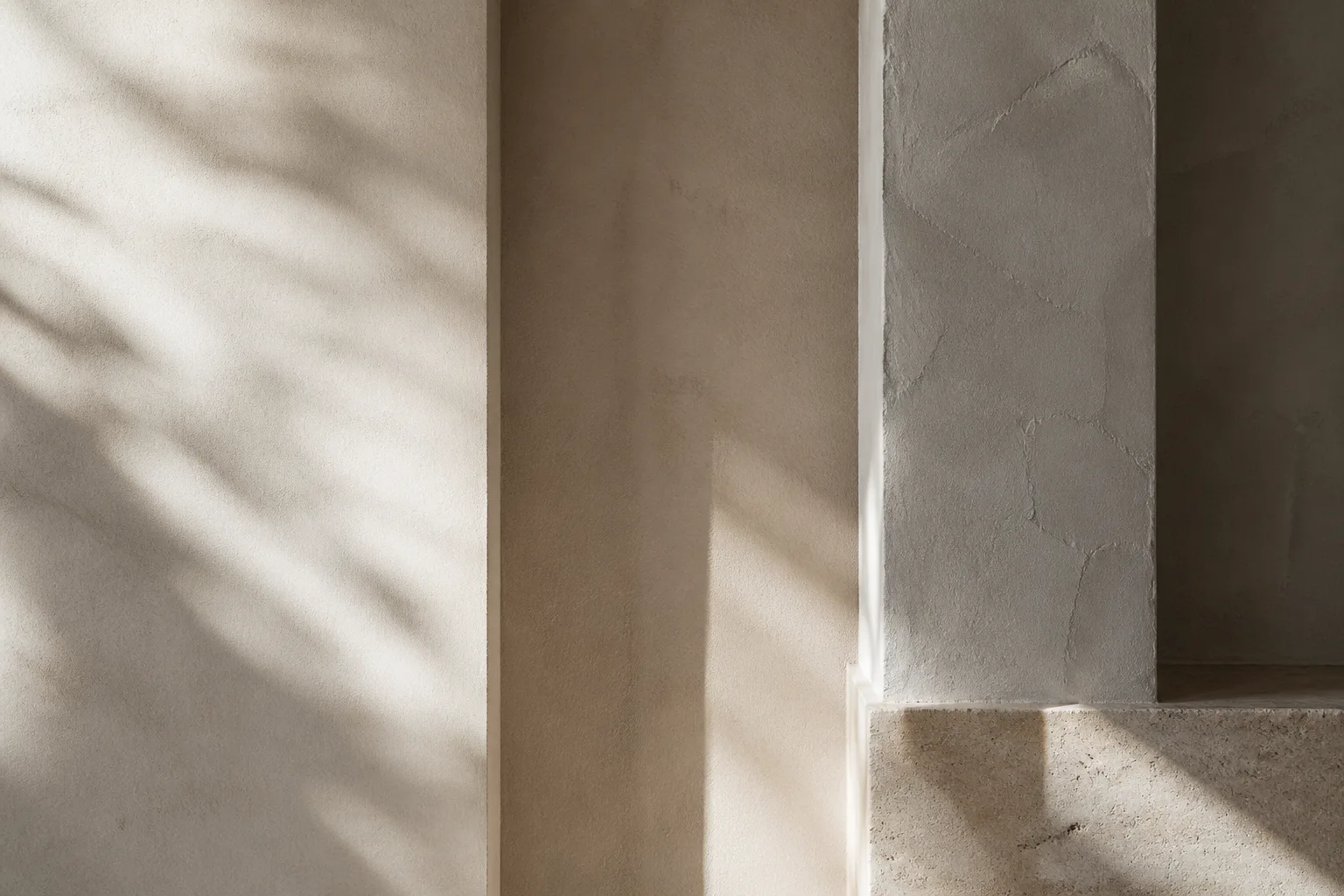
Light
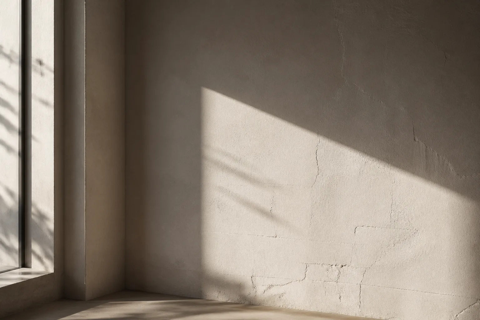
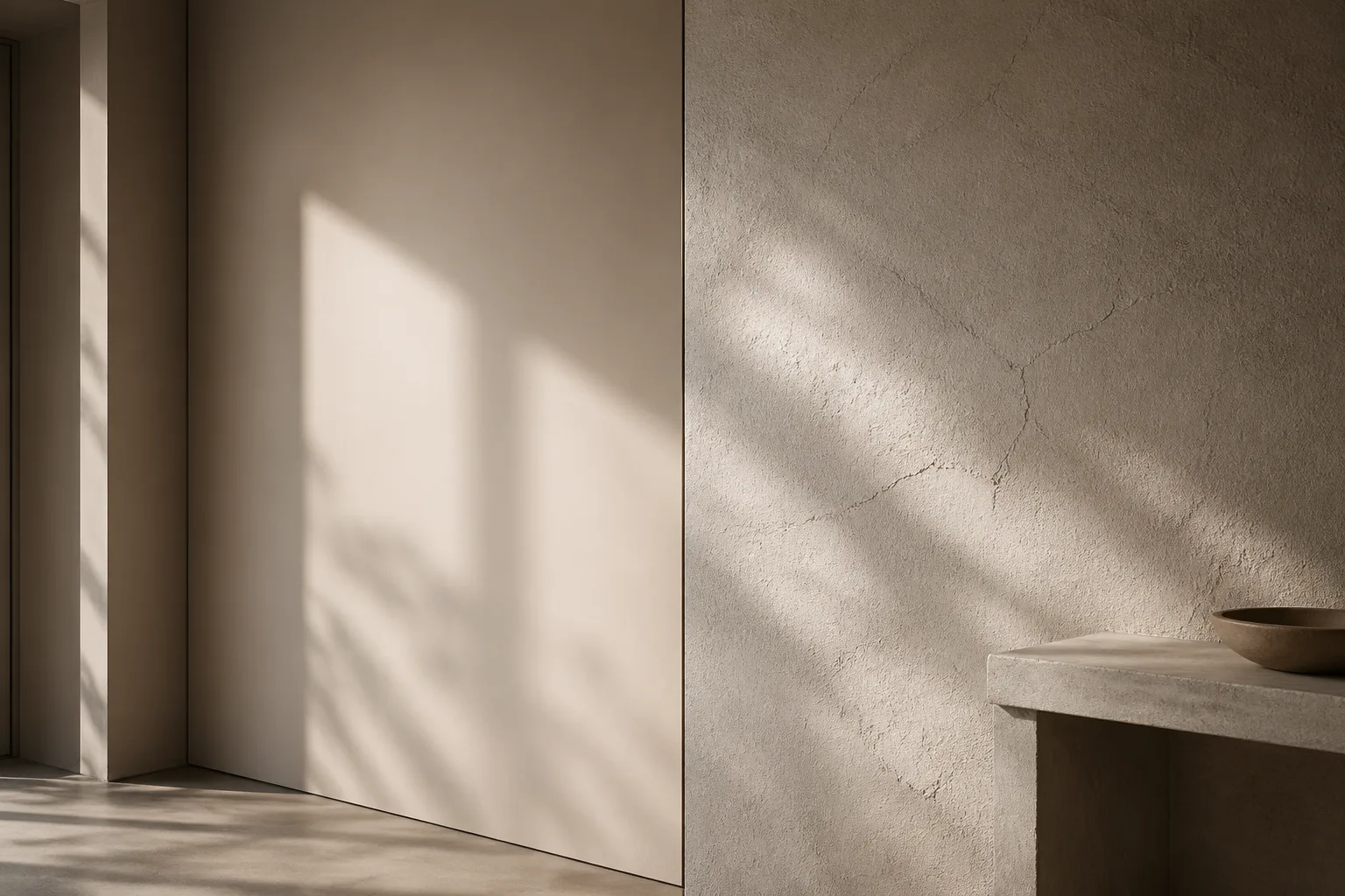
Understand how raking light, reflection, and shadow expose surface irregularities and shape interior perception.
Color
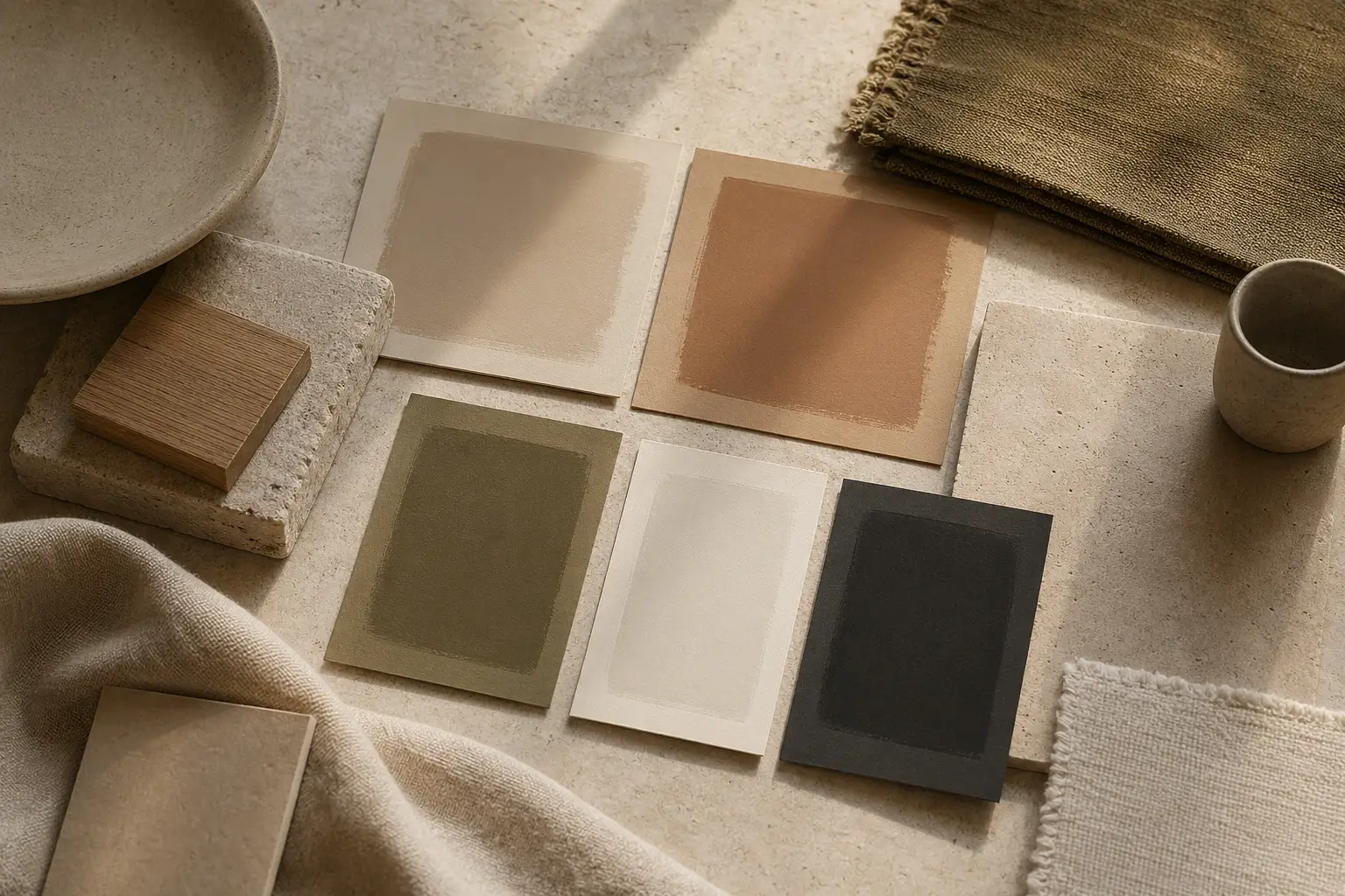
A thoughtful guide to color psychology in interior spaces, from muted neutrals to deeper tones that shape mood.
Modern Living
Why clean surfaces matter in modern homes, and how restraint can feel warm, intentional, and visually generous.
Surfaces
Compare smooth and textured walls through the lens of light, mood, tactility, and contemporary home aesthetics.
Brand Systems
Discover how rhythm, repetition, and tone from branding and editorial design can shape memorable interior spaces.
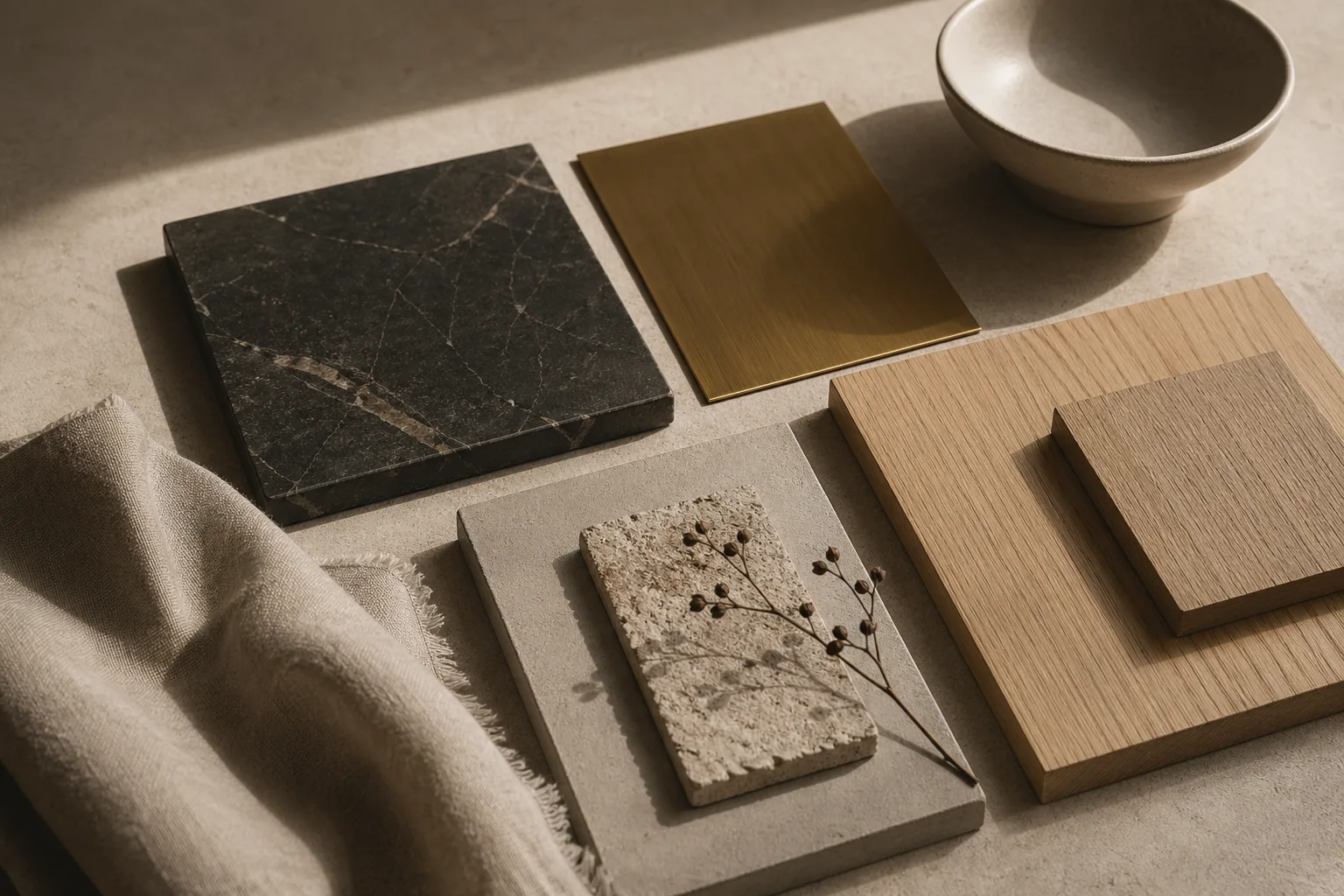
Materials
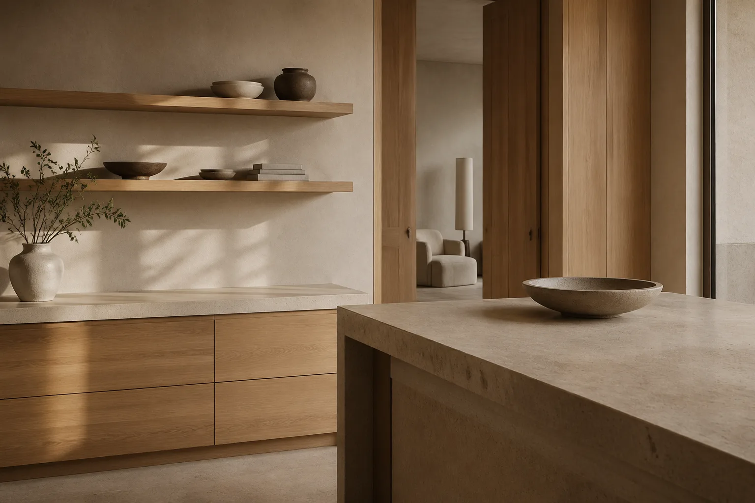
Learn how scale, finish, density, and contrast influence the visual weight of materials in interior design.
Cross-Disciplinary Design
See how principles from print design extend naturally into interiors through rhythm, proportion, texture, and spacing.
About the Publication
Compulsive Bodoni explores how typography, visual systems, surfaces, color, and spatial design influence perception and emotion. The goal is to connect the logic of print with the tactility of interiors and the atmosphere of everyday rooms.
Read the full about pageTopic Categories
Letterforms, rhythm, editorial systems, and emotional tone.
Plaster, paint, texture, and the psychology of finish.
Shadow, reflection, daylight, and perceptual accuracy.
Quiet palettes, tonal contrast, and room atmosphere.
Visual weight, tactility, and modern domestic balance.