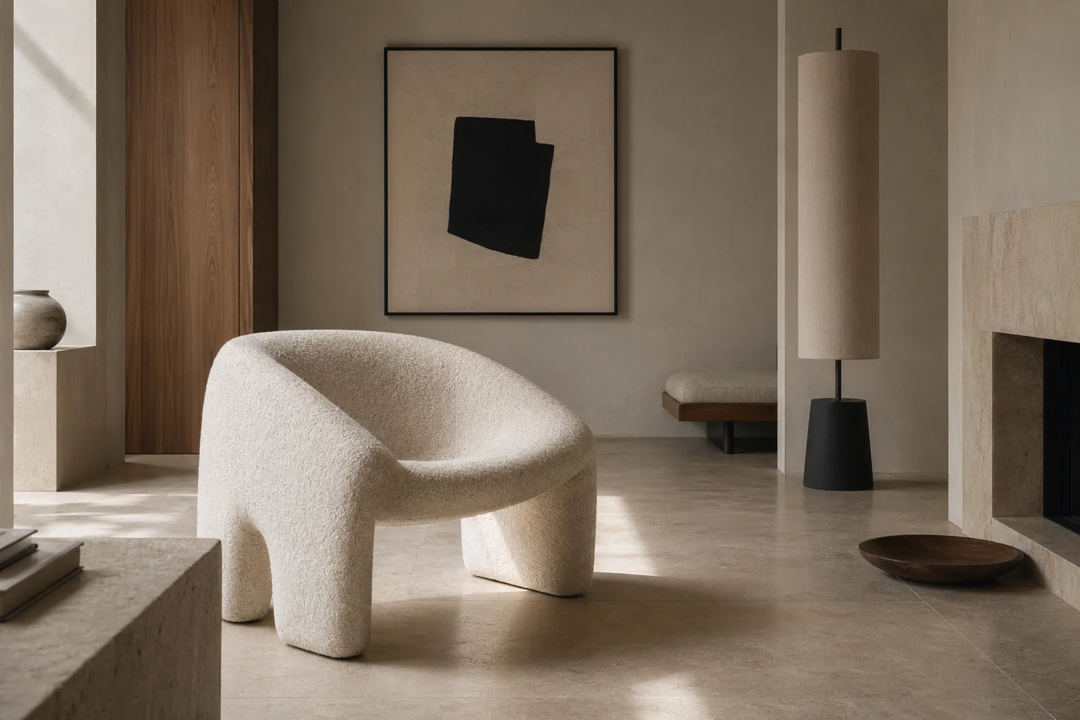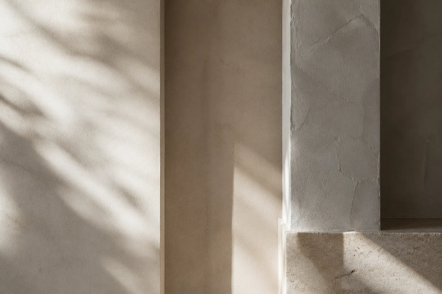
Clean surfaces are often misunderstood as a purely aesthetic preference, as if minimal rooms are simply trying to look expensive. In reality, uncluttered planes change the cognitive experience of a home. They reduce micro-distraction, make materials more legible, and allow proportion to emerge. The result can feel calm and generous rather than empty, provided the restraint is supported by warmth elsewhere.
Reading Material, Light, and Perception Together
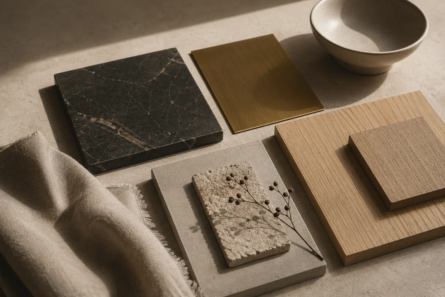
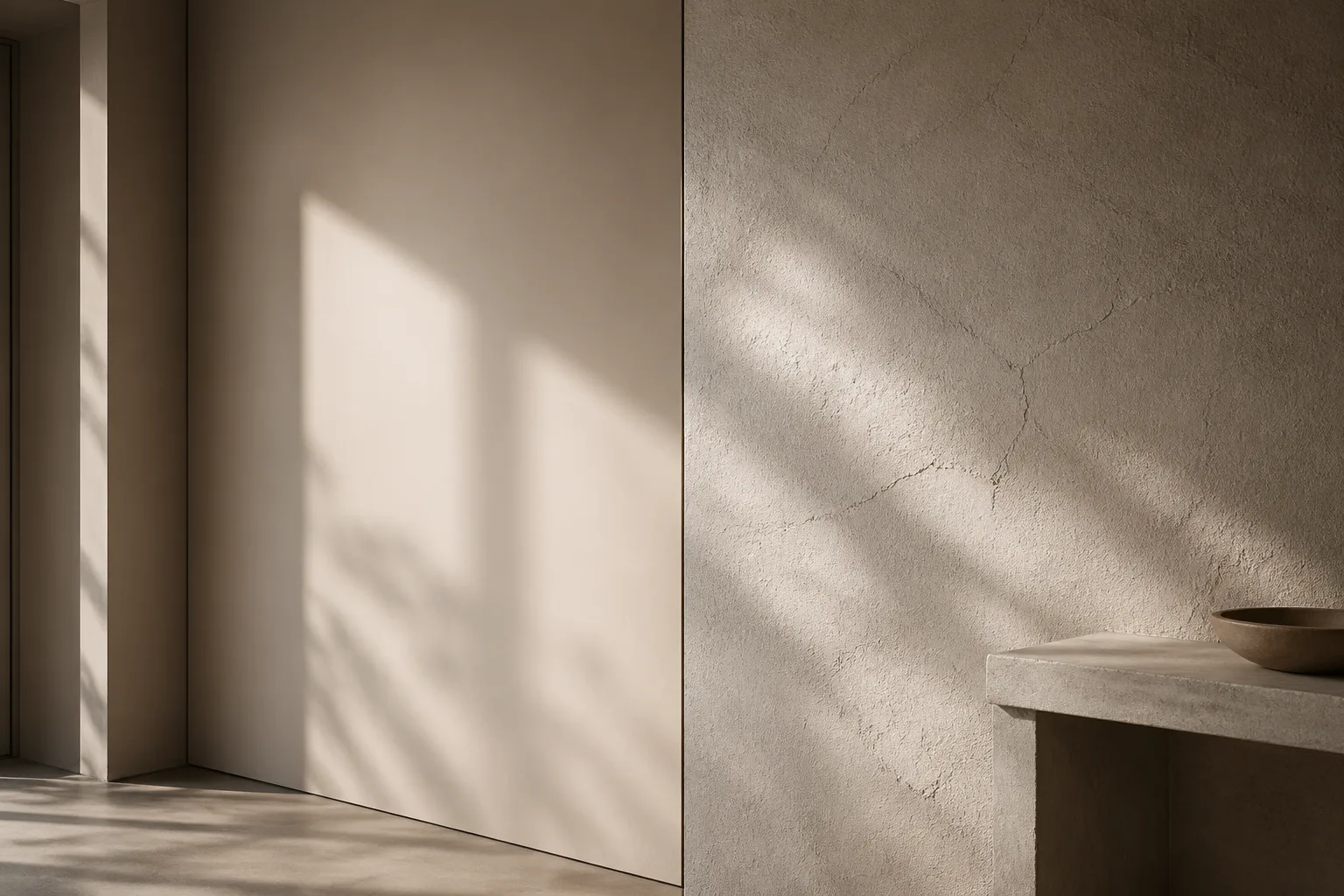
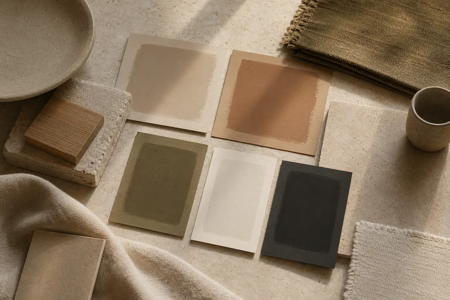
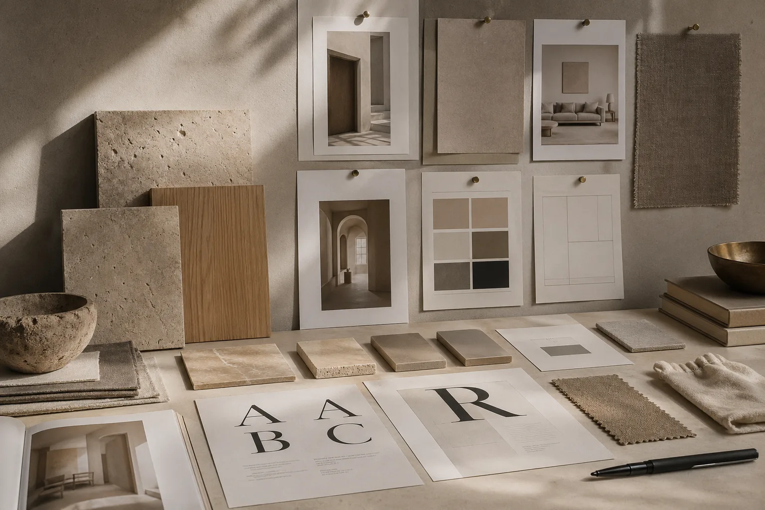
The key distinction is between absence and intention. A stripped room with poor light and weak material choices will feel cold. A pared-back room with tactile finishes, thoughtful scale, and layered neutrals can feel deeply hospitable. This is where the dialogue with material perception becomes useful: when objects are fewer, each remaining object carries more visual responsibility.
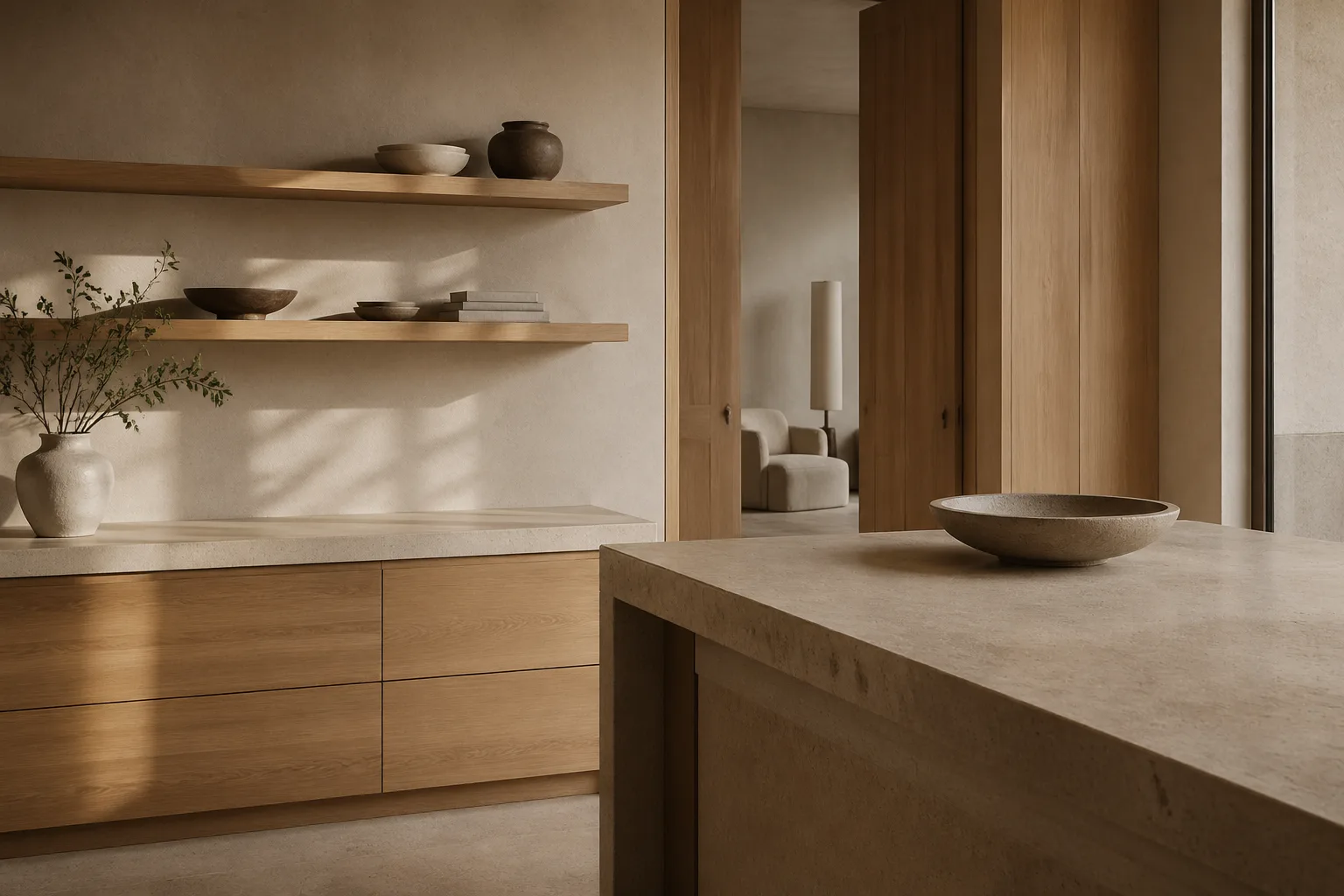
Clean surfaces also improve hierarchy. A table with only one ceramic vessel and one reading lamp gives the eye a clear point of entry. A counter crowded with small conveniences may be practical in the short term, but it flattens spatial rhythm. The same editorial logic appears in interior composition, where subtraction often increases clarity more effectively than addition.
Importantly, clean does not have to mean glossy or severe. Some of the most convincing modern homes pair simple planes with limewash walls, open-grain oak, or woven fabric. Texture keeps the room alive even when objects are reduced. That balance is explored further in our comparison of smooth and textured walls and in the broader mood-setting strategies of color psychology.
The best modern interiors understand that surface calm is not a style trick. It is a way of making attention feel less fragmented and everyday rituals feel more deliberate.
Where to Go Next
For a broader editorial map of the site, visit the about page, browse the latest writing on the homepage, or continue with linked essays on typography, color psychology, and cross-disciplinary design continuity.