A successful room rarely feels successful because it contains expensive objects. It feels successful because the eye knows what to notice first, what to notice second, and where to rest after that. This sequence is visual hierarchy, and it is as important in a living room as it is on a magazine cover. Without hierarchy, even beautiful pieces collapse into visual chatter.
Reading Material, Light, and Perception Together
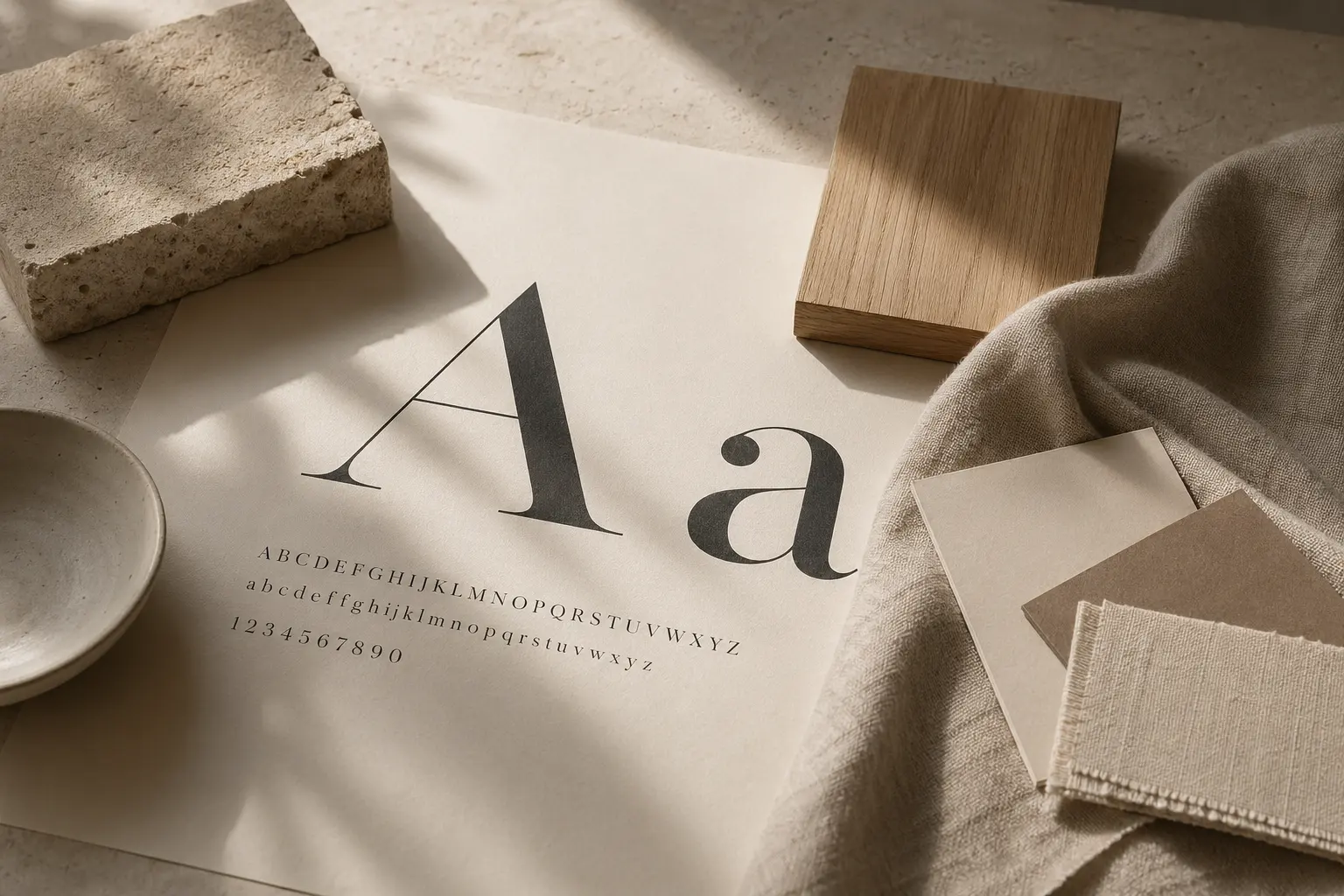
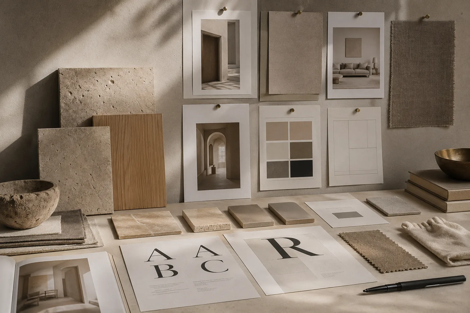
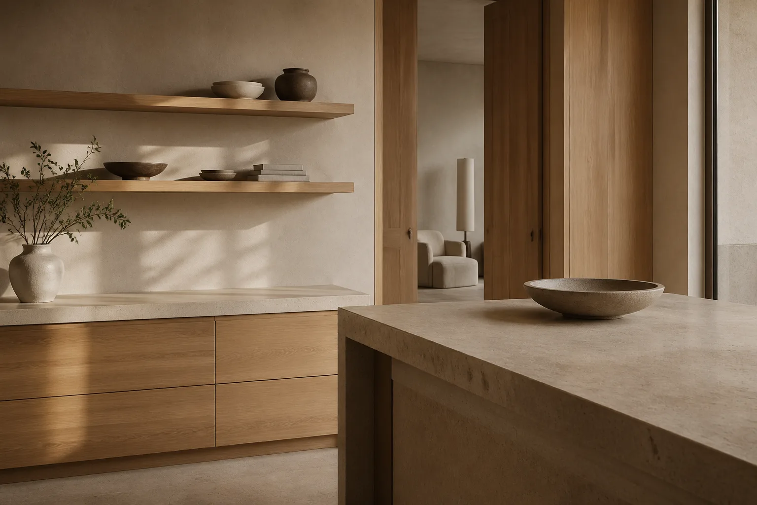
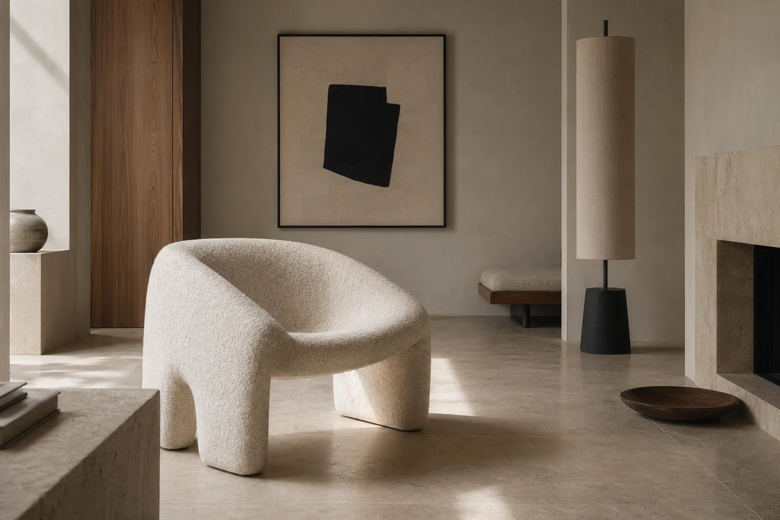
Interior hierarchy begins with scale and placement. A generous artwork, a dark-toned armchair, or a naturally dramatic window can all serve as the first note in a composition. The trick is not to multiply focal points. One confident gesture will do more for a room than five decorative interruptions. That principle echoes the lessons in typography and emotion, where emphasis works best when it is selective.
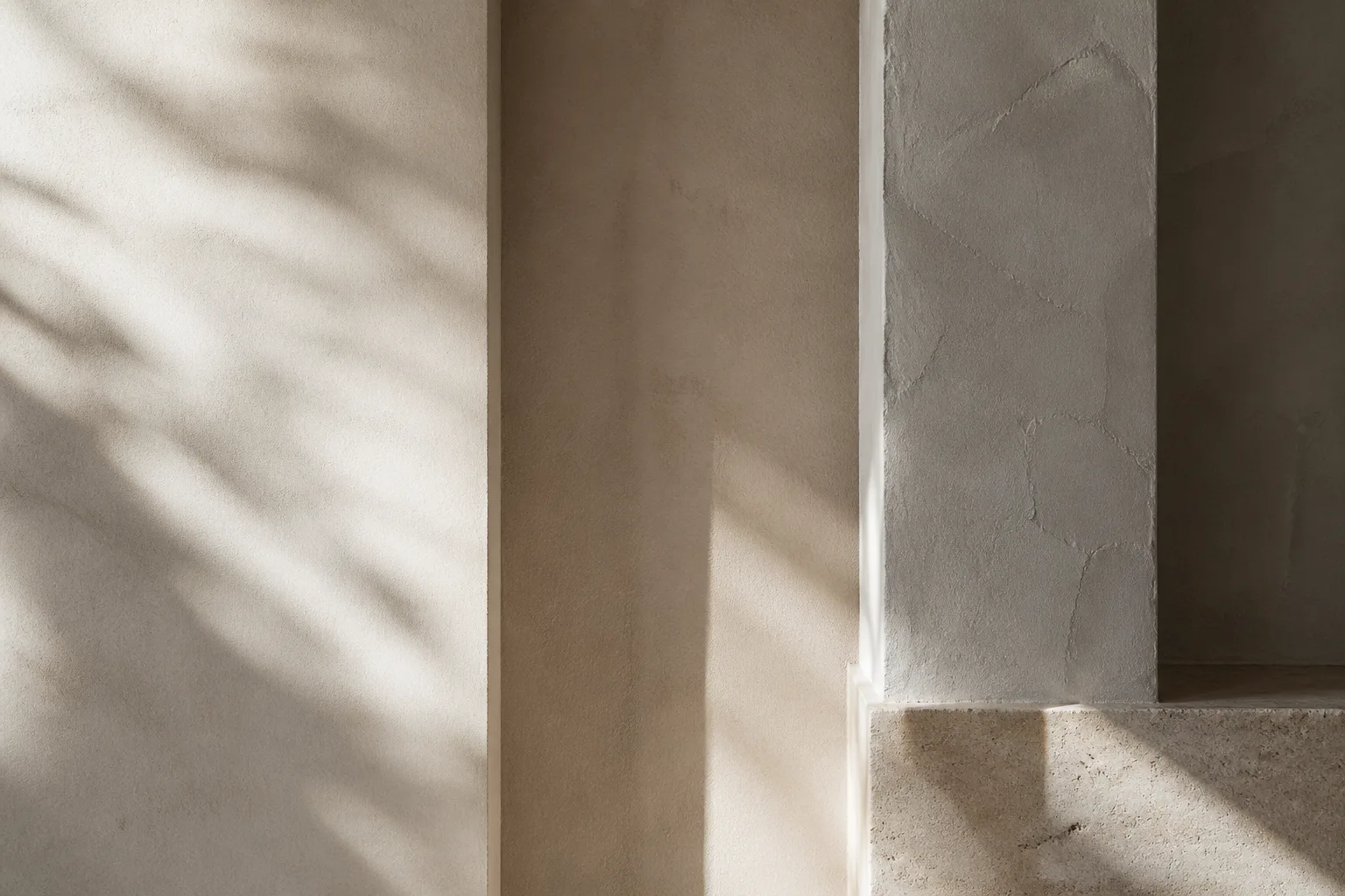
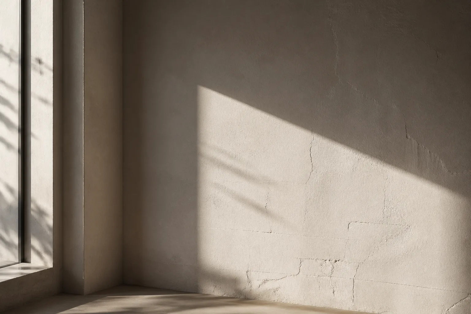
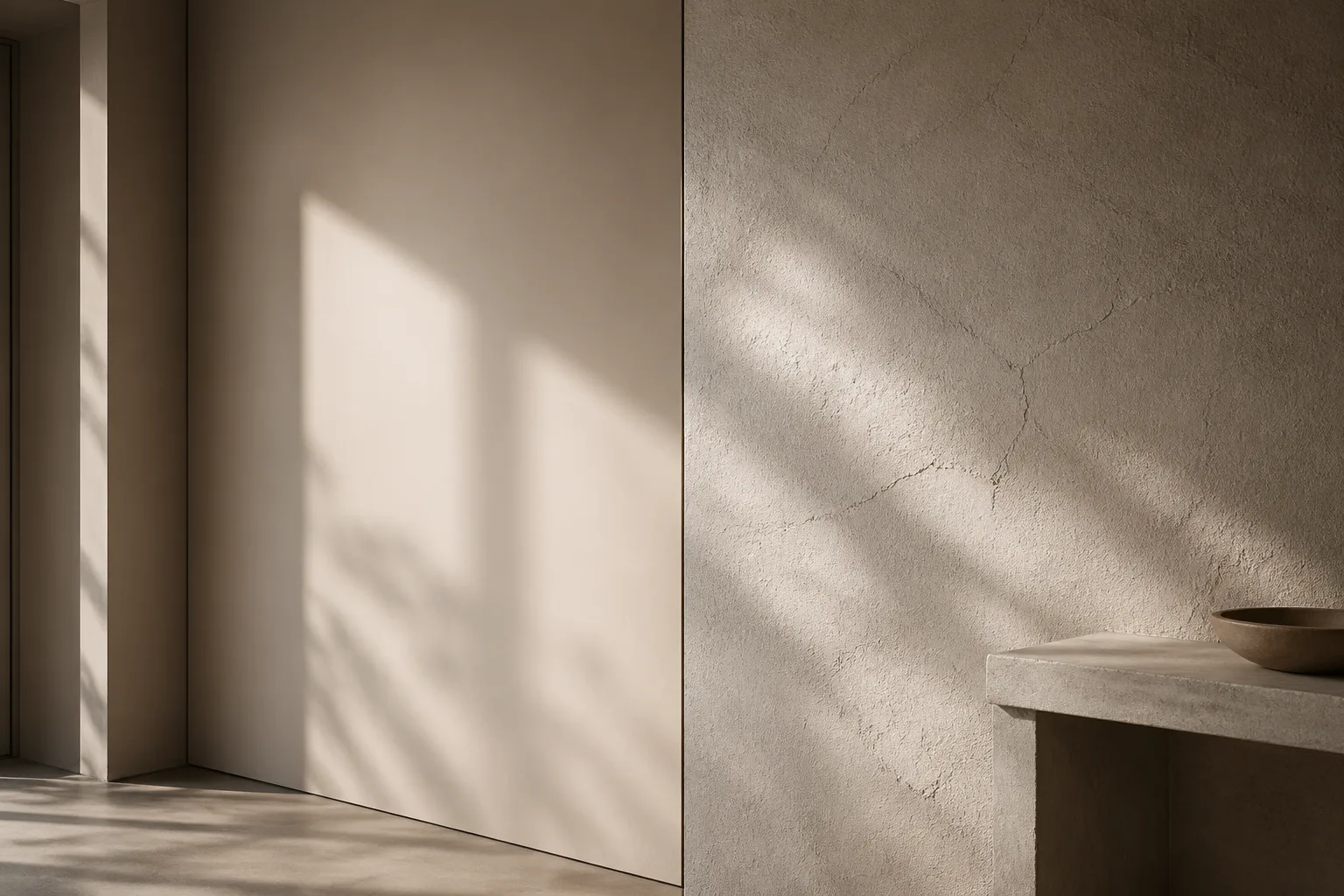
Contrast is the next tool. Light against shadow, matte beside gloss, rough next to smooth: these pairings help the eye differentiate layers. In rooms with subtle palettes, hierarchy often comes from texture rather than color, which is why wall perception and texture matter so much. A softly irregular limewash wall can become a visual anchor without shouting for attention.
Circulation also shapes perception. If a space reveals itself in stages, the hierarchy feels cinematic. The bench by the entry, the sightline to a table lamp, and the quieter background of shelves all work like editorial pacing. The effect is similar to the sequencing explored in branding lessons for spaces: identity becomes believable when repetition is controlled and transitions are intentional.
The most refined interiors do not merely display objects; they edit them. They accept that absence is part of composition. A room with clean surfaces, clear intervals, and measured accents is easier to read, easier to inhabit, and easier to remember. Hierarchy, in that sense, is less about styling and more about hospitality for the eye.
In renovation projects where surfaces need to be rebuilt from the framing stage, many homeowners invest in professional drywall installation in Huntington Beach homes to create cleaner wall geometry and more consistent visual flow throughout the interior.
Where to Go Next
For a broader editorial map of the site, visit the about page, browse the latest writing on the homepage, or continue with linked essays on typography, color psychology, and cross-disciplinary design continuity.