Print and interiors are often placed in separate professional worlds, yet both are ultimately arts of organizing attention. A spread, a room, and even a storefront ask similar questions: what arrives first, what supports it, and how does the whole remain coherent over time? Once that continuity is recognized, the relationship between typography, material, and space becomes less metaphorical and more practical.
Reading Material, Light, and Perception Together
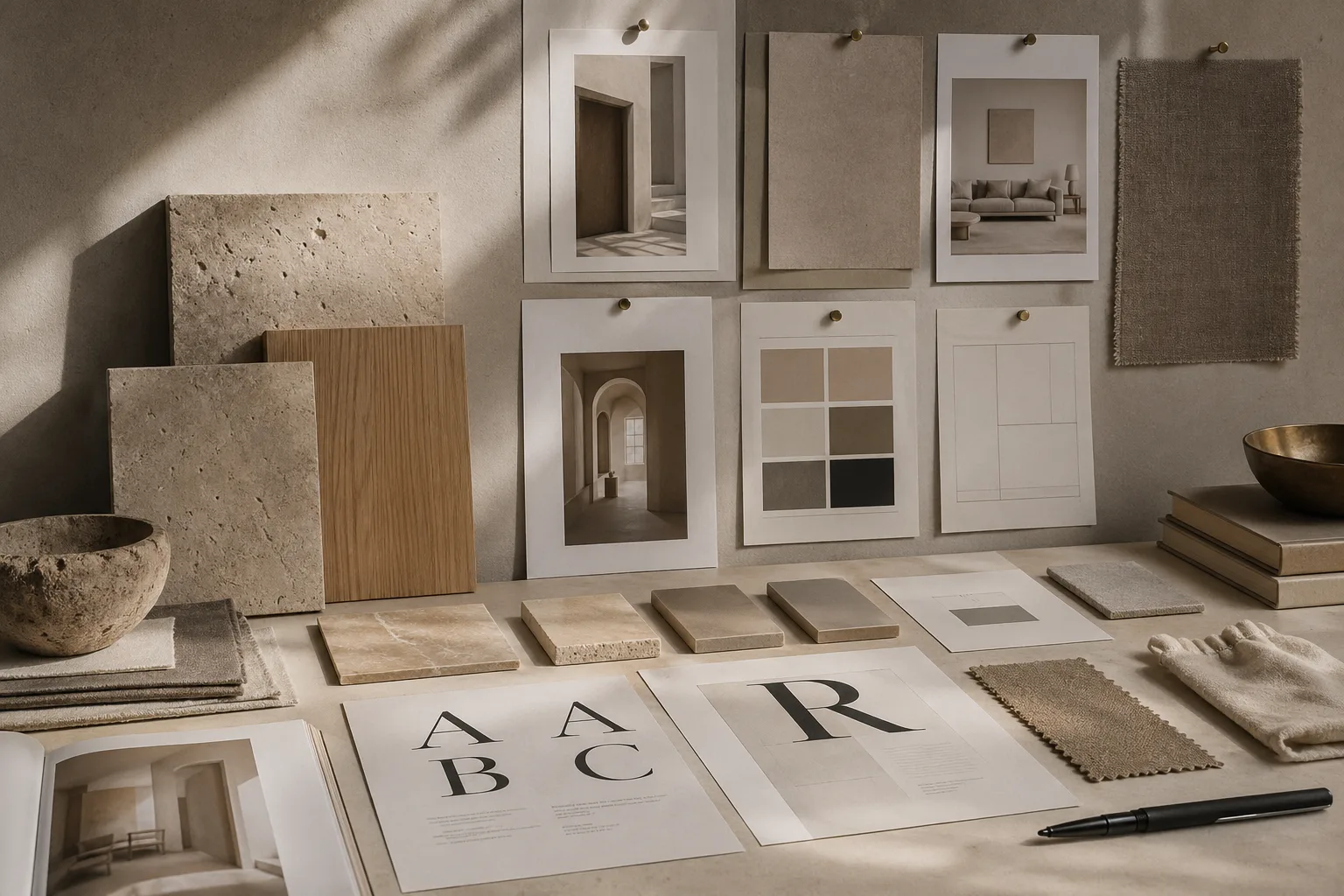
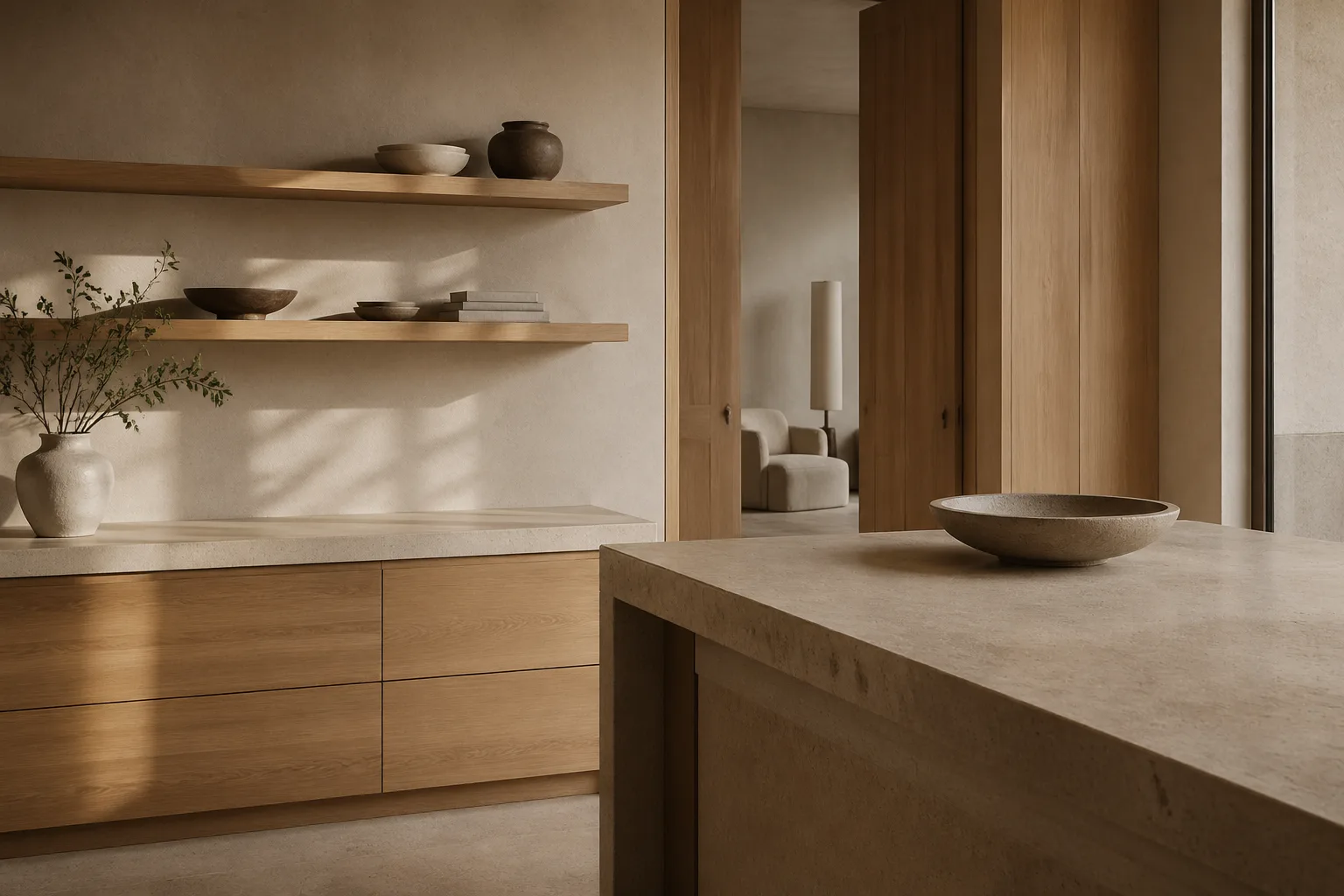
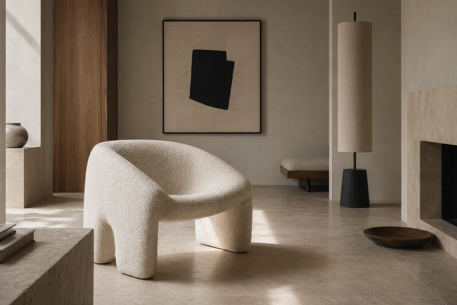
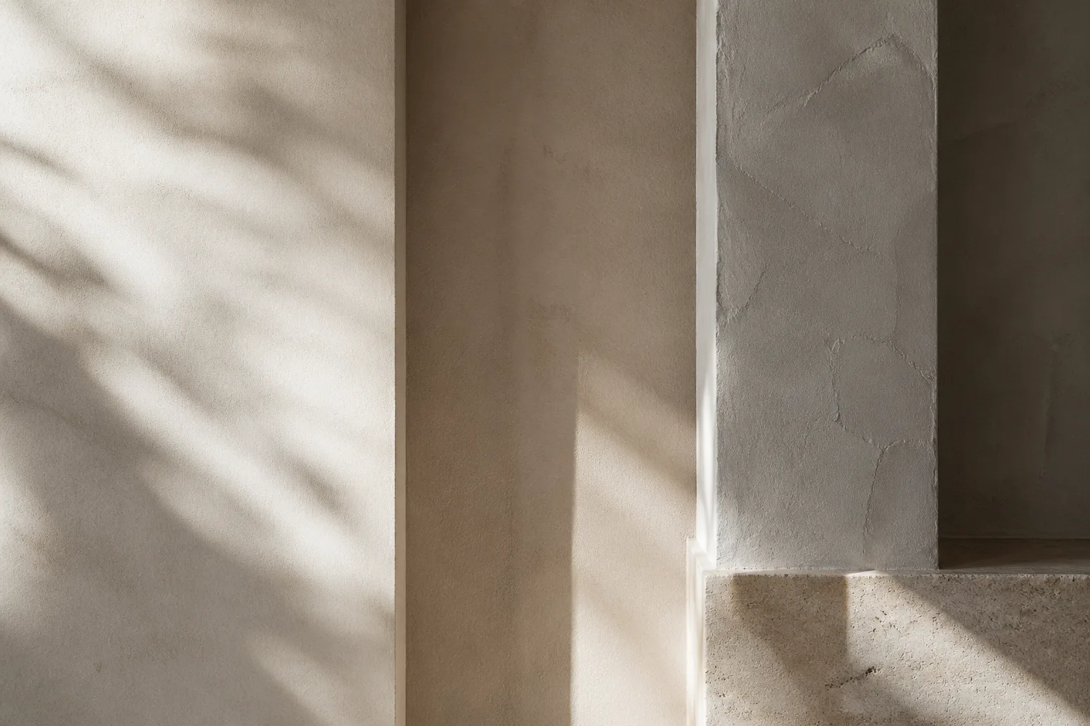
Spacing is the most obvious bridge. Margins in print behave like breathing room in architecture. They slow perception, reduce friction, and lend dignity to content. Rooms with generous clearances and measured negative space create the same effect physically. This is one reason clean surface design can feel editorial rather than merely minimal.
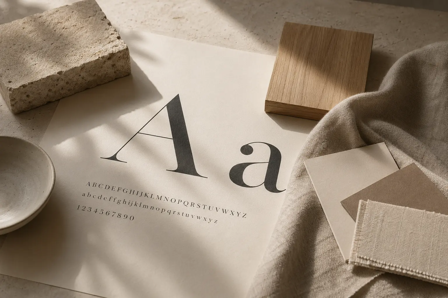
Rhythm is another shared structure. Repeated alignments, controlled contrasts, and calibrated intervals give both pages and spaces their sense of order. The lessons in typographic mood and brand coherence are not side topics here; they are the grammar of continuity across scales.
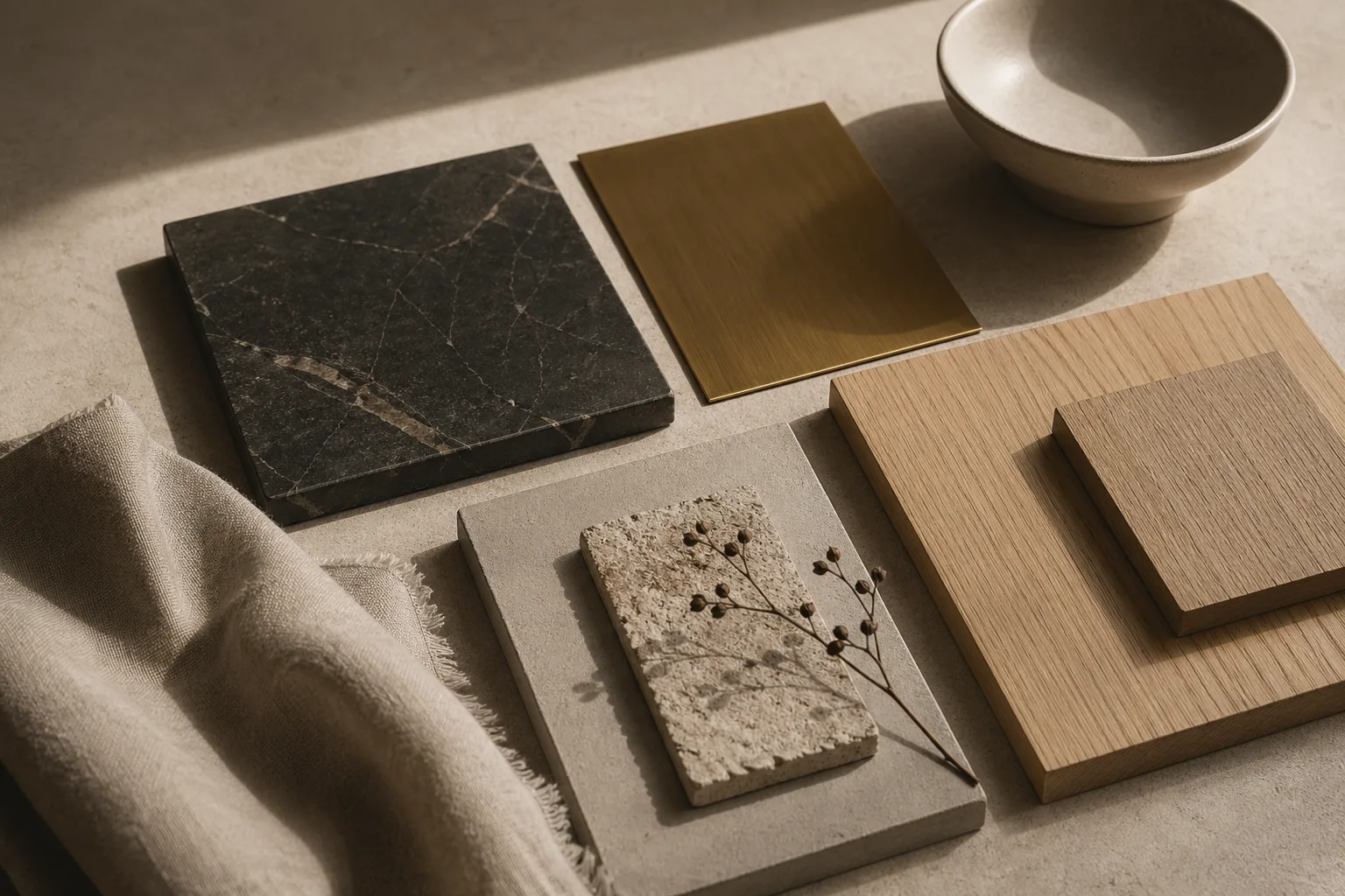
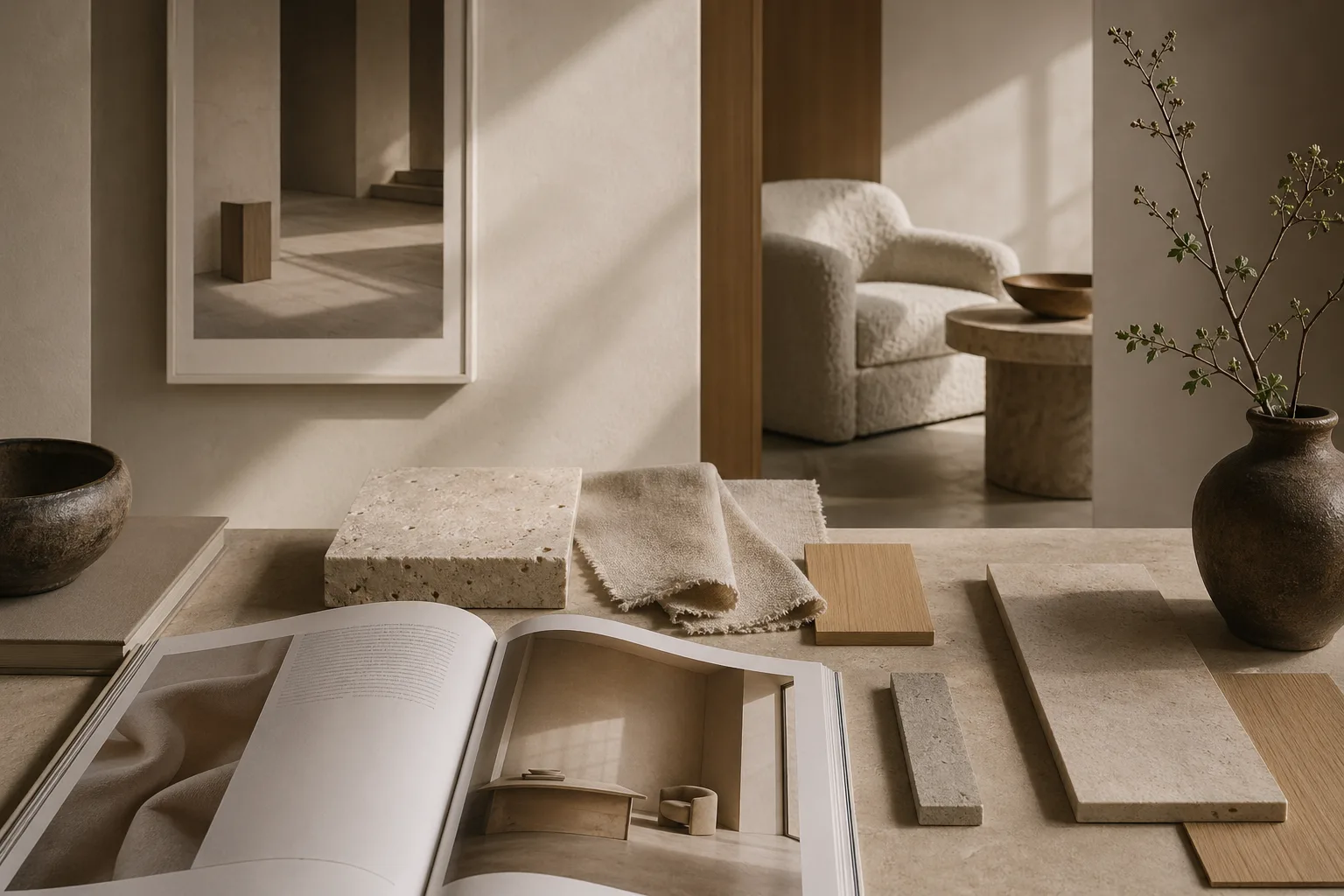
Materiality adds a dimension that print designers increasingly appreciate. Paper stock, ink density, and binding texture all influence how a publication is felt, just as plaster, timber, and stone alter the emotional register of a room. When these choices point in the same direction, the result feels authored rather than assembled. A high-contrast masthead can converse beautifully with a dark stone threshold or a quiet bronze detail.
This continuity matters because people do not experience design in silos. They move from page to screen to room, carrying expectations about quality, clarity, and tone. The most persuasive design work respects that continuity and treats every scale as part of one larger visual culture.
Where to Go Next
For a broader editorial map of the site, visit the about page, browse the latest writing on the homepage, or continue with linked essays on typography, color psychology, and cross-disciplinary design continuity.