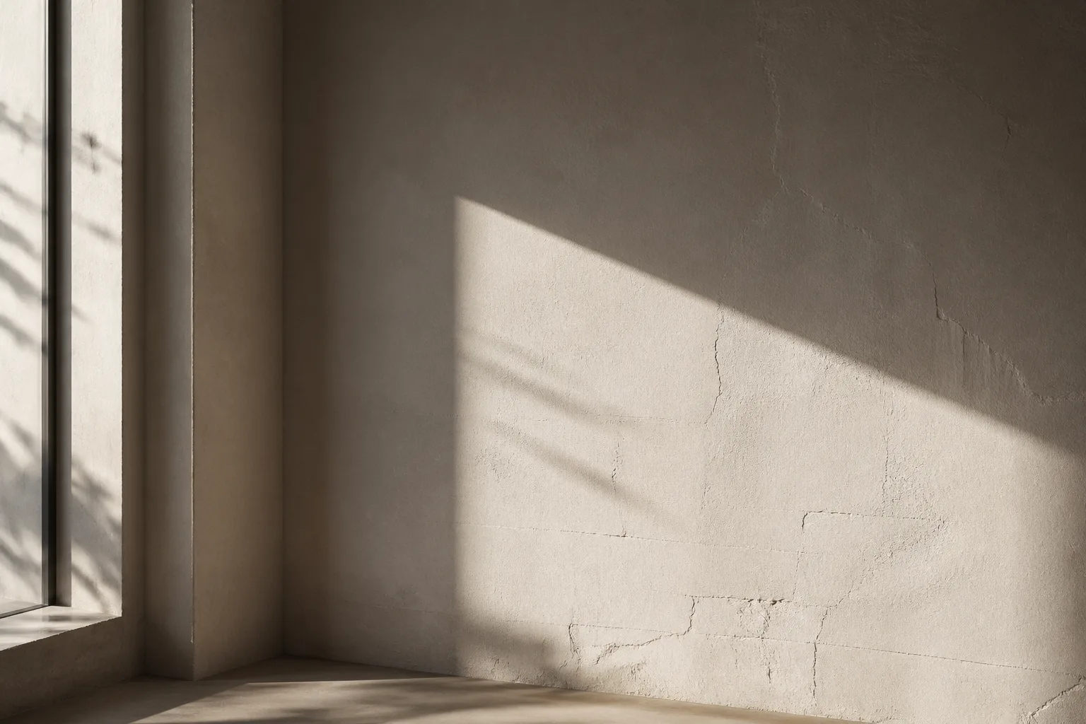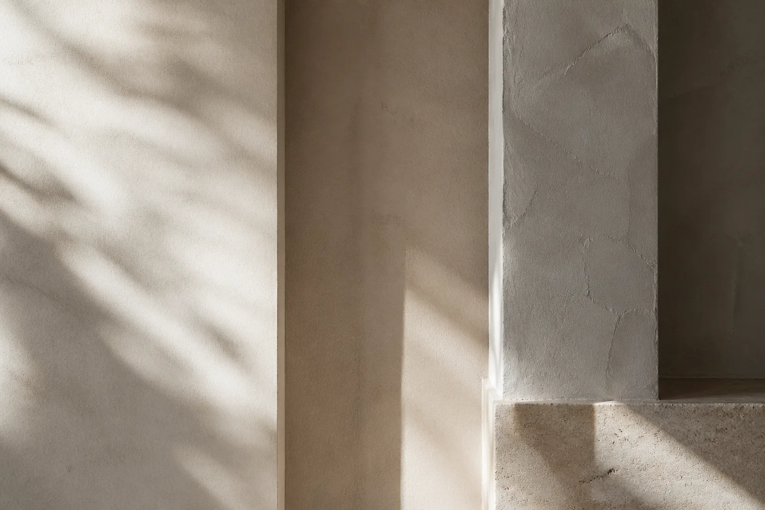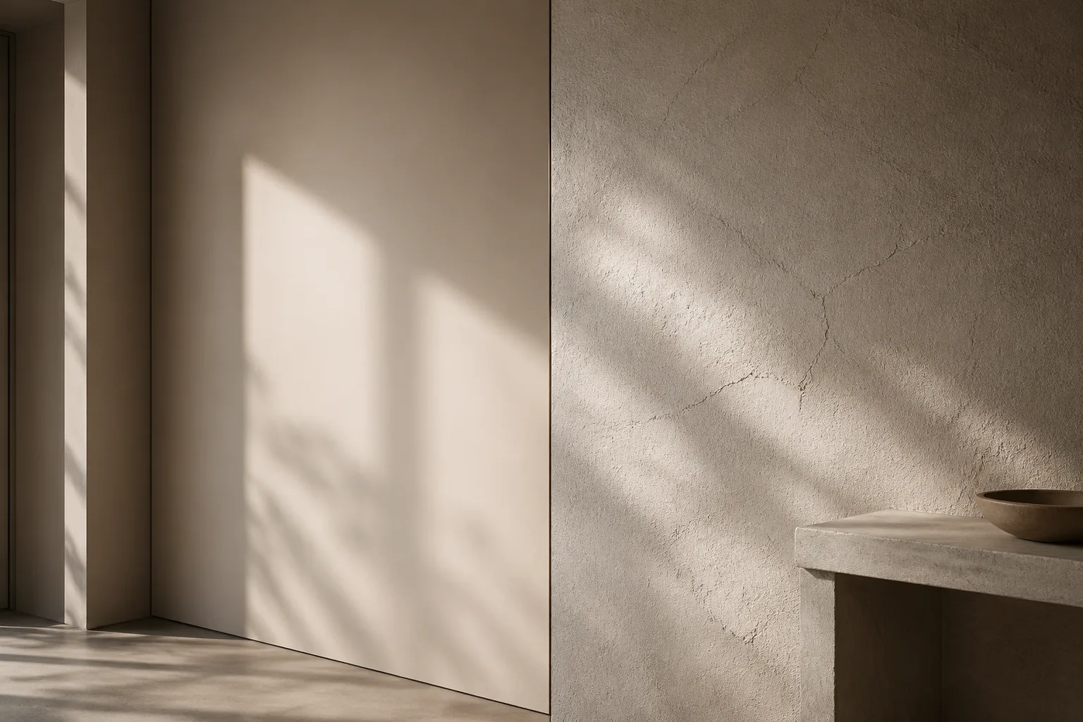
Smooth and textured walls do more than offer different finishes. They establish different visual temperatures. Smooth walls tend to read as disciplined, graphic, and contemporary. Textured walls tend to read as tactile, atmospheric, and slow. Neither is inherently better. The better choice depends on what kind of perceptual rhythm the room needs.
Reading Material, Light, and Perception Together
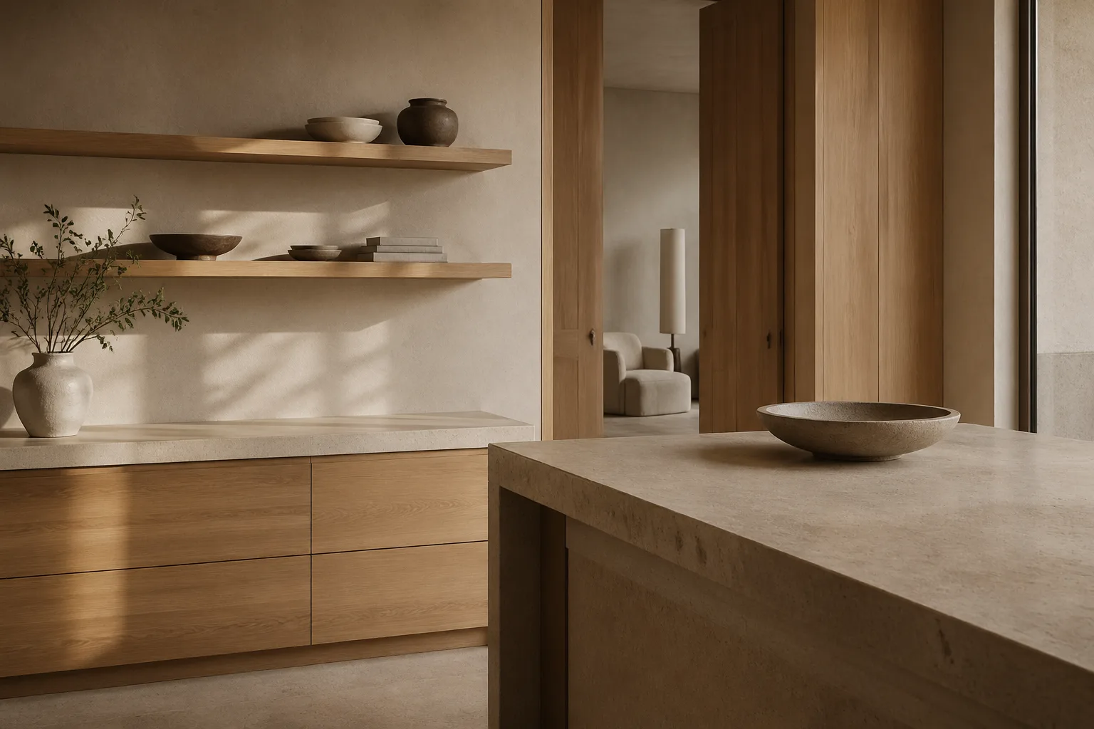
Smooth walls are especially useful when furniture, art, or typographic elements need a clean stage. They simplify shadow behavior and make edges feel crisp. In compact spaces, that precision can be clarifying. Yet perfectly smooth planes also increase scrutiny under angled light, which is why surface visibility becomes part of the decision from the start.
Textured walls, by contrast, absorb minor inconsistencies into a larger field of movement. They can help a room feel older, softer, or more grounded without relying on overt decoration. That effect resonates with the emotional pacing described in typographic mood: a little irregularity often introduces humanity and depth.
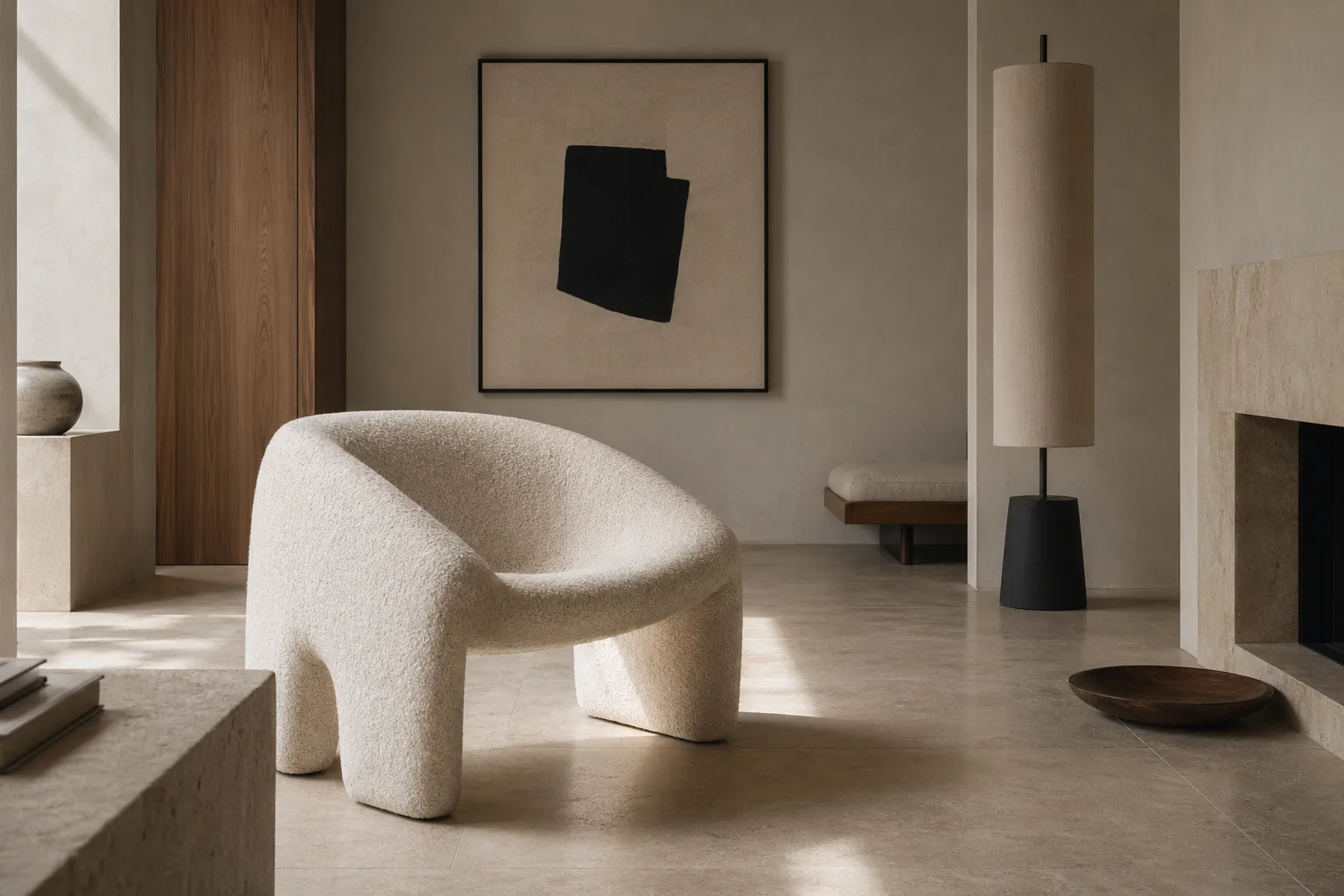
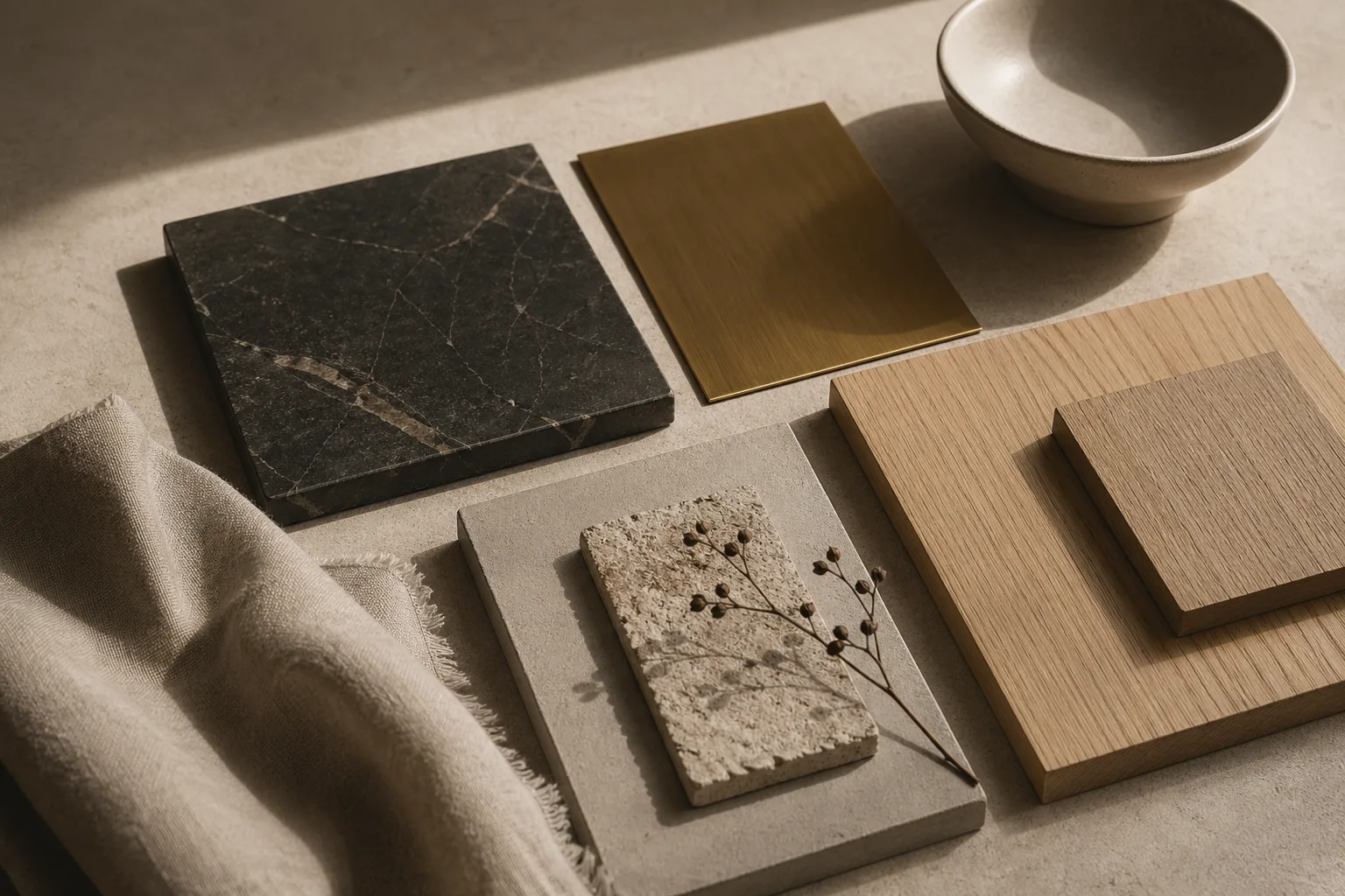
The most successful projects choose finish according to the room's broader language. A gallery-like apartment with strong artwork and minimal joinery may benefit from quiet smoothness. A sunlit bedroom or dining room with natural materials may feel richer with subtle plaster variation. The visual hierarchy of the space, discussed in this guide to focal order, should always lead the finish choice.
In practice, the debate is less about smooth versus textured than about alignment. When walls, light, and furniture all speak the same perceptual language, the room feels composed. When they compete, the finish becomes a distraction rather than a support.
Where to Go Next
For a broader editorial map of the site, visit the about page, browse the latest writing on the homepage, or continue with linked essays on typography, color psychology, and cross-disciplinary design continuity.